UOFT’S DENTISTRY (4 ISSUES)
ART DIRECTION: DEAN MITCHELL
FRESH ART & DESIGN
ILLUSTRATION & PHOTOGRAPHY DIRECTION: ME
/ Cover Each cover was designed by the carefully
selected illustrator. Artistic direction is based on
my interpretation of the featured articles
/ Spreads All spreads are built from an un-templated
grid using content and feedback from the client.
All photographers were hand selected and
briefed with my artistic direction
URBAN STRATEGIES PROMOTIONAL STICKERS FOR INTERNATIONAL TRANSIT CONFERENCE
ILLUSTRATION COMPONENTS BY: MPACT TEAM
/ Stickers conference was held in Toronto, the objective of the stickers was to encapsulate the firm’s urban design impact on Toronto
INDIGENOUS ART FESTIVAL
ART DIRECTION: DEAN MITCHELL
FRESH ART & DESIGN
ILLUSTRATION BY: ME
COVID CANCELLED EVENT
/ Visual Used for all promotional campaigns pertaining
to the festival. The design utilizes a tree that is inspired
by indigenous art. The idea behind this concept was to
signify the bond within indigenous communities and
how they are similar to those found in family lineage
PERSONAL WORK
ILLUSTRATION BY: ME
Conceptional redesign of SAD, an independent Vancouver publication. This design won an honourable mention from RGD student contest with over 950+ entries.
/ Cover Reimagined cover for the magazine that
was intended to sustain the mood of the original
/ TOF Displays the main articles in this issue
accompanied by their page numbers in a way that
is more eye-grabbing for the reader
/ Spreads The conceptional redesign sustains
the mood as well as the motive of the original
(to showcase art, letting the typography not
overshadow the artists being highlighted)
FOREST HILL ORTHO POSTER
ART DIRECTION: DOMINIC AYRE, FRANCES CHEN
HAMBLY & WOOLEY
ILLUSTRATION BY: ME
/ Poster Using Frances Chen’s pattern design created
for the branding of Forest Hill Orthodontics in a topical
and interesting way
PDAC’S SPRING ISSUE OF CORE
ART DIRECTION: DOMINIC AYRE, TAYLOR KRISTAN
HAMBLY & WOOLEY
/ Spreads Cohesive section built from a
untempled grid. Style is based on PDAC’s CORE
brand presence
PERSONAL WORK
SAMPLE PHOTOS BY: JEN MANN
A design showcase catalogue for graduating graphic
design students with a focus on typography.
/ Spreads Allow the typography to create a
texture. Paired alongside simplistic geometric
shapes with the pop of a bright primary colour
so that the student’s work can shine through
PERSONAL WORK
TAG LINES WRITTEN BY: ME
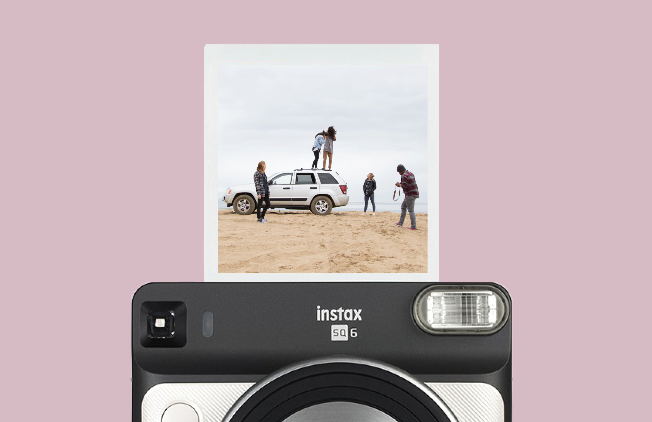
/ Magazine Ad Explores all new features of the
camera in a simplistic way
/ In-Store Poster Right by the camera’s, lays out
all the new features without detail
UOFT’S TRINITY COLLEGE SPRING ISSUE
ART DIRECTION: BARBARA WOOLLEY, TAYLOR KRISTAN
HAMBLY & WOOLEY
FONT BY: TAYLOR KRISTAN
/ Cover The templated rectangle opposite to the
masthead was converted into a cellphone to fit the
theme of the article– how smart phones are changing
our language and means of communication